Role: Staff Product Designer,
MobileTimeline: 2021–2024
Scope: iOS & Android apps, 10+ core components
Impact: 50,000+ lines of legacy code removed · ~50% faster Android build times · ~80% of UI migrated to system components
The issue wasn’t just visual inconsistency — it was speed. Sprout’s mobile apps relied on so much custom UI that dark mode and tablet layouts routinely broke, engineers spent weeks maintaining legacy code, and design debt slowed down new features. At the same time, our iOS and Android apps felt disconnected from each other and from Sprout’s web brand.
Without a unified, native design system, we risked slower delivery, higher maintenance costs, and a fragmented user experience.


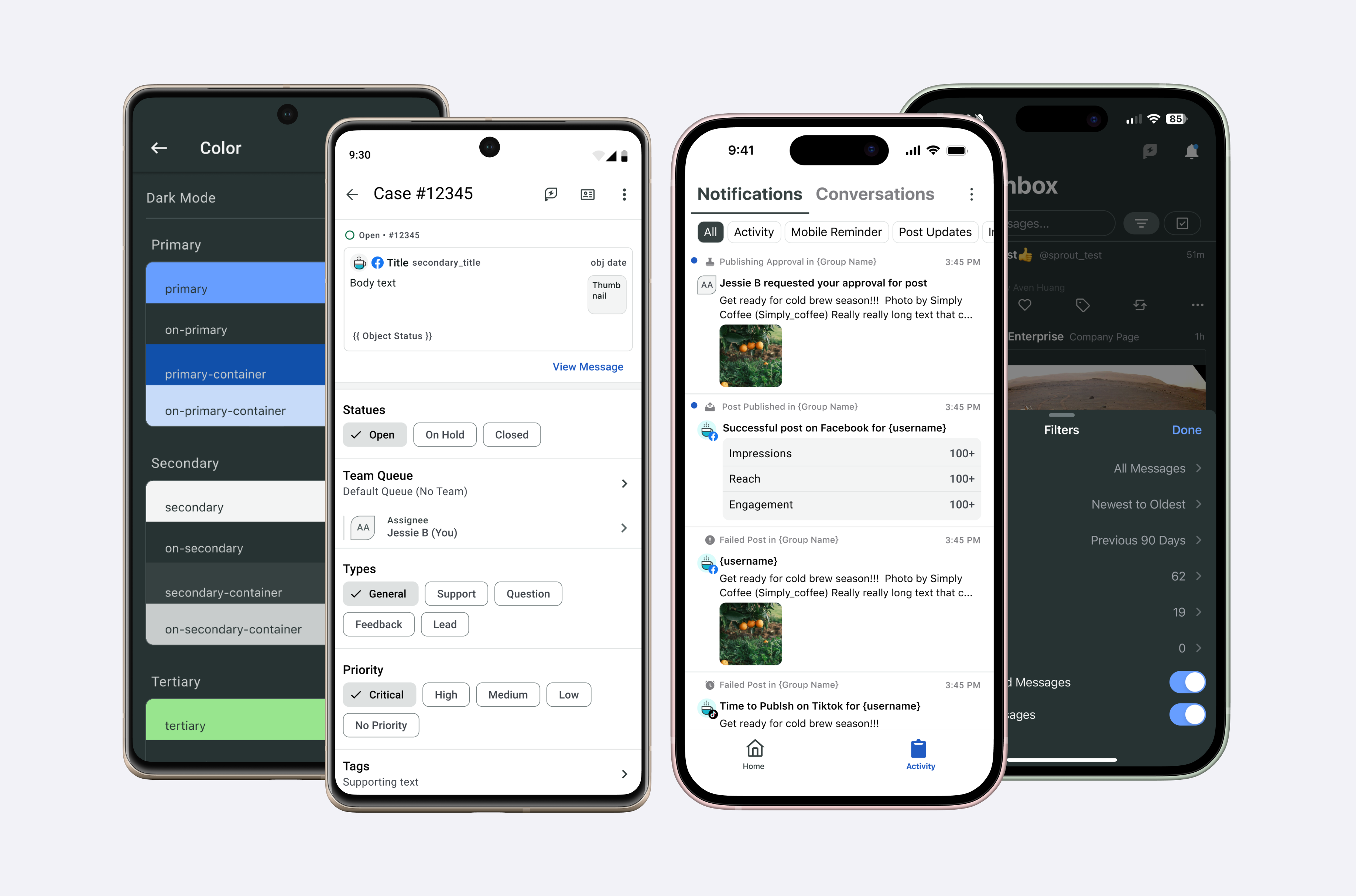
I embedded design-system work directly into sprint planning through an “Iterative Improvements” epic. Instead of pausing product development for a big-bang overhaul, I shipped steady progress: refreshing avatars, refining secondary navigation, updating buttons and bottom sheets, and modernizing the app bar. Each release replaced legacy UI with system components while giving PMs visible value.

With the Android Engineering Manager, I scoped a Material 3 foundation of color, typography, and spacing. We built and branded core components, then created a gallery as a single source of truth. Timing this work with our Jetpack Compose migration allowed us to move features directly onto the system rather than in parallel.


Material 3 limitations. This teamwork enabled us to finalize most of the gallery.
I partnered closely with engineers through regular syncs to ensure alignment on component behavior, platform nuances, and migration strategy. Alongside this collaboration, I created dedicated Figma design systems for both iOS and Android, which included usage guidelines, component variants, and do/don’t examples. These design libraries gave engineers a clear reference point and reduced ambiguity during handoff, helping us retire legacy components and adopt new ones with confidence.


